Design of Southold’s newest parking sticker becomes ‘teachable moment’ for Town Board

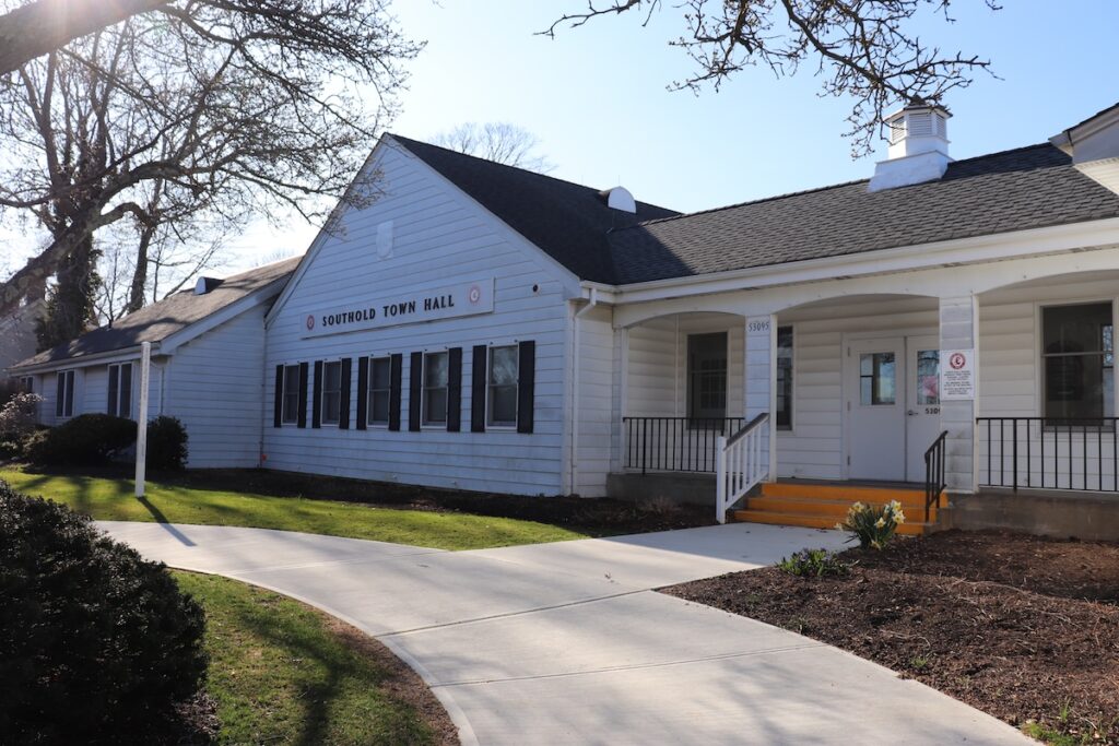
The Southold Town Board recently addressed community comments about the design of its 2024-2025 beach parking stickers, which some felt resembled an historically controversial symbol.
Via email, a resident informed Town Clerk Denis Noncarrow that users on Nextdoor, a neighborhood-centric social media site, had noted the potential resemblance of the pink-hued triangle on the recently issued town parking stickers to the pink triangles the Nazis pinned on alleged homosexuals during the Holocaust.
Some three decades later, that same symbol was “reclaimed” by members of the LGBTQ community as a sign of resistance to discrimination. Today, pink triangles are generally regarded as symbols of pride and tolerance and are rarely associated with the horrors of World War II.
Mr. Noncarrow, whose office issues the stickers, raised the topic at the Board’s Feb. 27 meeting in an effort to assure the community that any perceived similarities between the stickers and the symbol were entirely unintentional.
“There was some controversy over the color and the shape of the stickers this year,” Town Supervisor Al Krupski said at the start of the meeting. “I just want to assure people that it was not the intent of the Town Clerk’s office or the Town Board that they represent anything other than [that vehicle owners] are in fact a resident of Southold Town.”
“We get together with a lot of different committees, a lot of different department heads, to figure out what works best,” Mr. Noncarrow said of the process behind designing the stickers, which are reissued with new designs every two years. “Everybody saw this as the perfect shape at this time … There was a lot of effort put into making this happen and making it come to be. We really didn’t see anything else with it but that.”
During the meeting, Mr. Noncarrow explained the pass was designed to include a shade of red similar to what appears on official Southold Town seal, but “when it’s sheathed in this protective coating to last in the elements, it changed a little bit.” Red was chosen because other options did not “pop the way we wanted it to,” he added.
“I think everybody agreed this wasn’t done in any intentional way,” Mr. Noncarrow said in a telephone interview. “But next time we do a permit we will reach out more to see if there is anybody else that has something to say. We’ll go to different organizations or individuals to weigh in on it.”
Council member Brian Mealy, the board’s liaison to the Southold anti-bias task force, said the incident could serve as a “teachable moment.”
“It’s so important that we have that educational component,” Mr. Mealy said during the meeting. “There are educational links that we have. If somebody in the community is interested in learning the educational part, you can reach out to me or the anti-bias task force and you can get the educational links … We’re not trying to hurt anybody, but we want people to be aware of what those symbols mean and what the current understanding is.”
The links Mr. Mealy referenced come from stories in Time magazine and the the History channel.
In a telephone interview, Mr. Mealy explained the board decided to proactively address the issue in case there were members of the community who may feel “hurt” by the choice of the symbol.
“I don’t think we had any substantive complaints by email or by phone, just general community comments,” the councilmember said. “We didn’t want people who may have been hurt by the similarity to not be acknowledged.”
“It was not an intentional act, it just happened to be a coincidence,” Mr. Mealy added. “We acknowledged that there are people who are sensitive to that symbology. I’m proud that I have enough education with diversity and equity that I do know the LGBTQ community has co-opted the symbol, and it is a symbol of resilience. People from the era survived and told their story. It is a symbol that’s been co-opted by the community, and rightly so.”


